
Pentland brands – LIVING HISTORY
yesterday's projects. today's tools.
yesterday's projects. today's tools.
Section 1: Introduction
Pentland Brands might not be a household name, but many of their brands are: Speedo, Berghaus, and Endura. In 2003, I had the privilege of working on a campaign pitch for Speedo created around the headline “Making History Again and Again.” A writing partner came up with the line and with the idea to carry it across an entire campaign. My job was to make the imagery work: finding the visuals, shaping the layouts, and building the atmosphere that gave those words a stage.
When a client couldn’t afford the time or budget for custom photography, my go-to was stacks of photo references, stock libraries, a scanner that smelled like it might catch fire, and long nights in Photoshop and Quark (yes, it was Quark back then lol). Campaigns lived on posters, in magazines, and on billboards.
AI didn’t invent this campaign, nor did it replace the creative process. It was a tool, much like Photoshop or Illustrator, that expanded the possibilities. These are my first-pass versions. The raw initial creative. No edits or refinements from a CD.
Fast forward to today, I’ve returned to the same idea. It’s a marker of growth for myself and for the industry. I wanted to see what Making History Again and Again could look like if I redesigned it. Only, this time, the process included Gemini, ChatGPT, and other AI tools—things I couldn’t have imagined back then. But the principle stayed the same: respect the athlete, respect the story, and deliver visuals that make the viewer look twice.
These are my first-pass versions. The raw initial creative. No edits or refinements from a CD.
Credits: Images used for concept exploration only. All rights belong to their respective copyright holders.
Section 2 – Then vs. Now
When I first touched this campaign in the early 2000s, I was still proving myself, eager to say yes to every challenge, building credibility one headline and one layout at a time. Early in my career, my job was about speed, hustle, and getting something strong out the door. The work was ambitious, but I was still learning how to balance instinct with discipline.
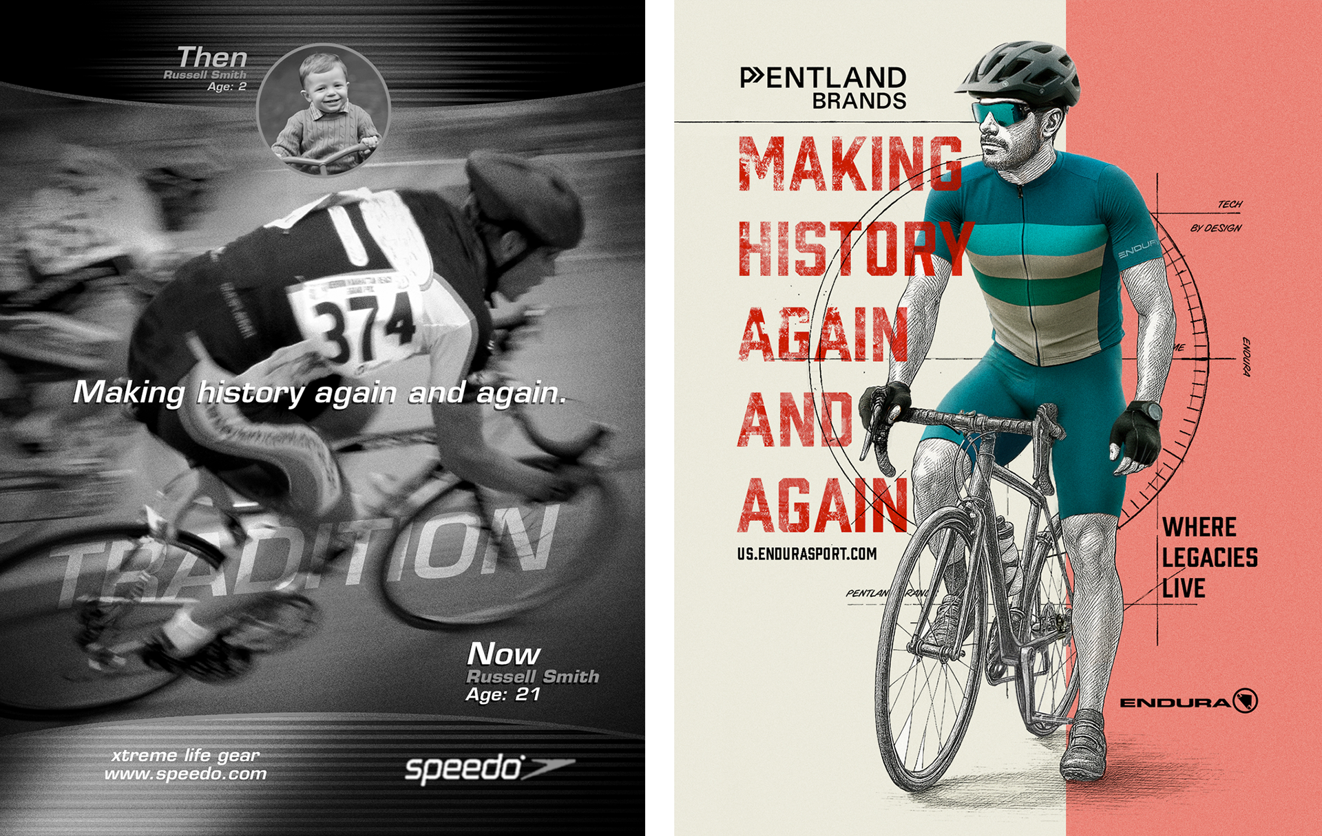
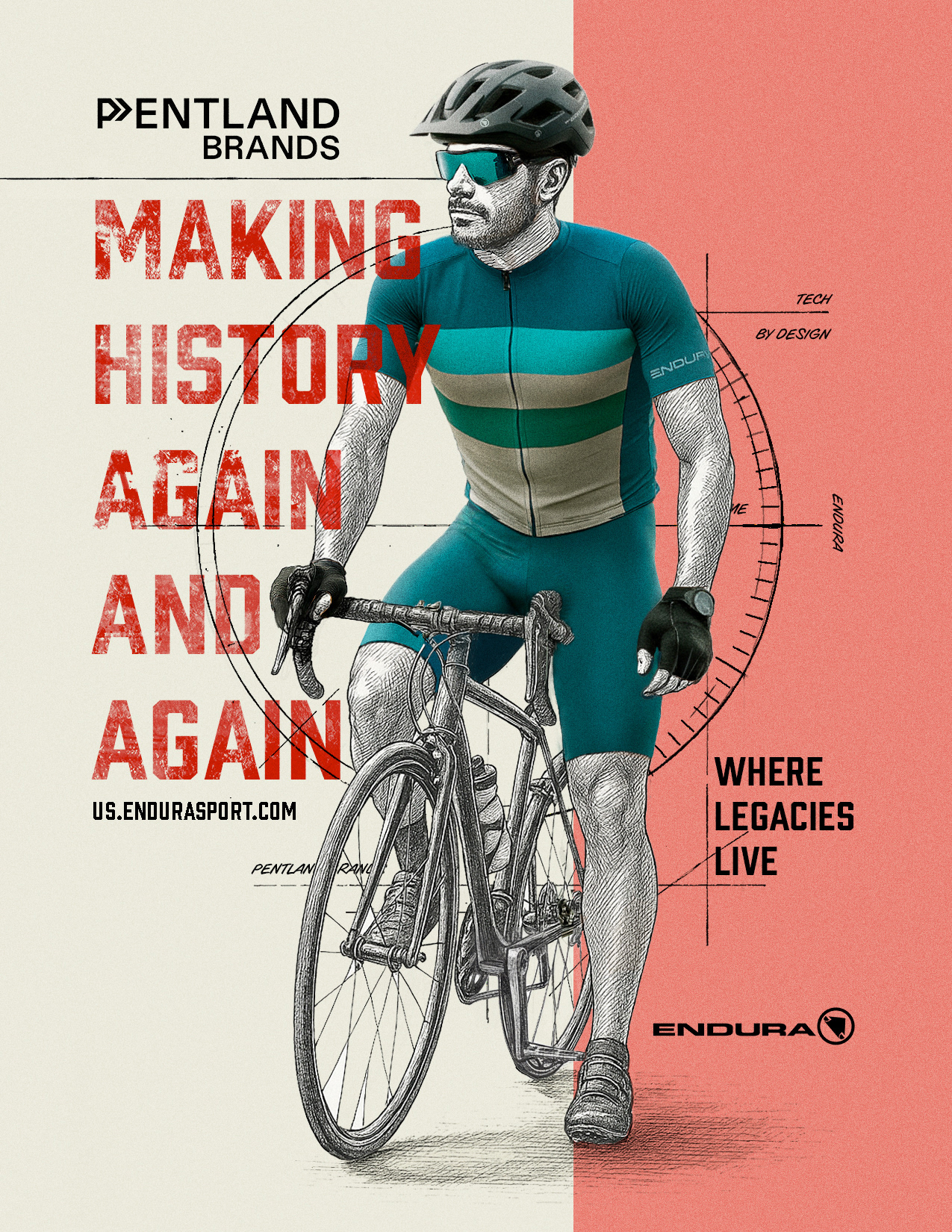
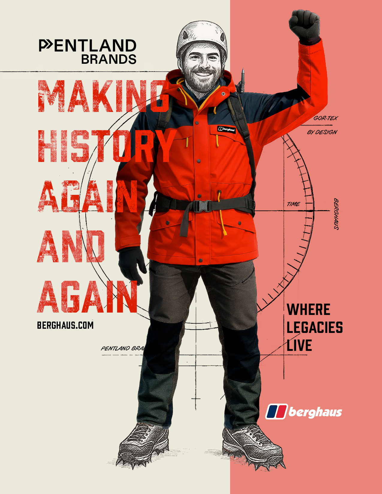
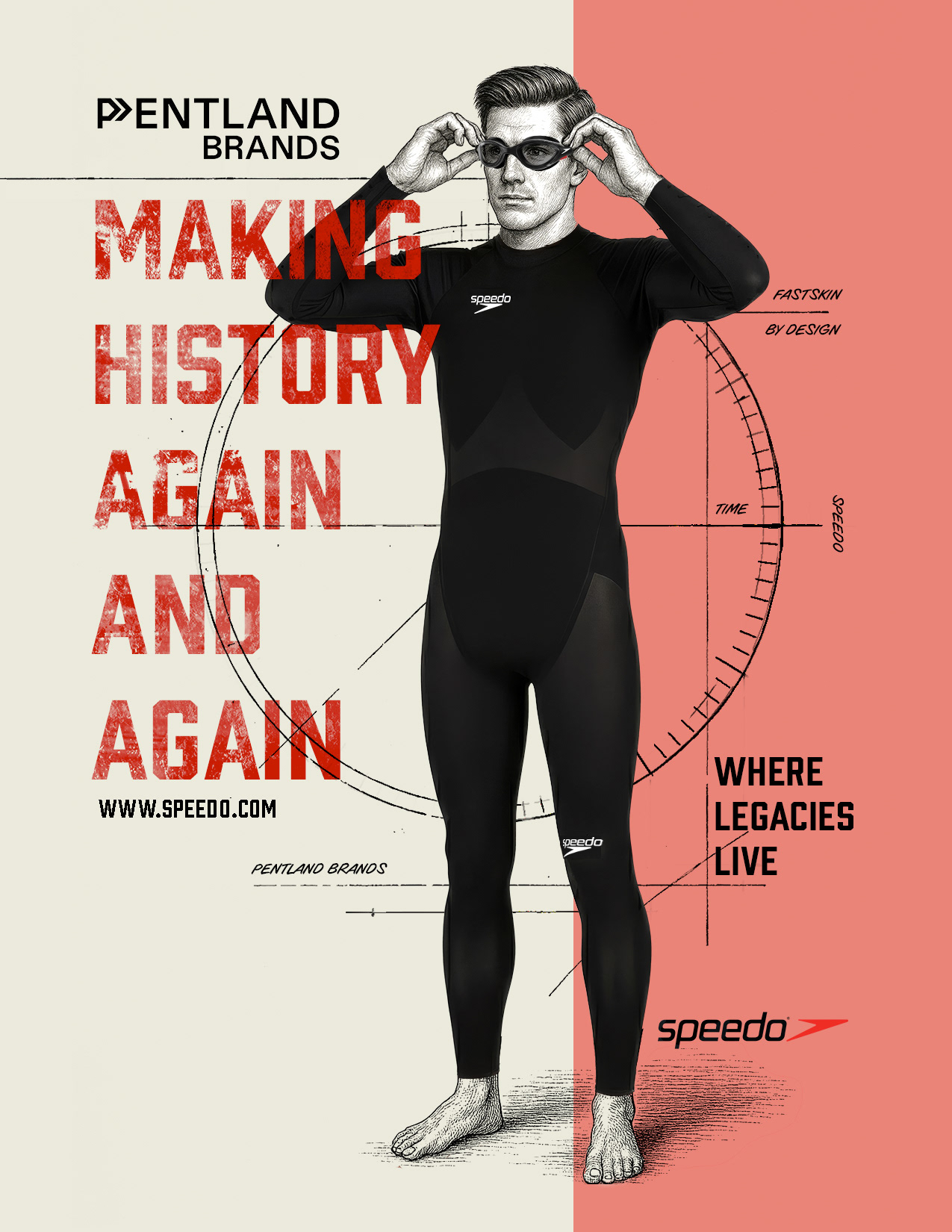
For the new Pros, I wanted to spotlight the product itself — setting a legacy tone through a vintage aesthetic, paired with clean modern typography to bridge past and present.
Now my relationship to the creative is different. Good design isn’t just about how quickly you can make something look polished. It’s about clarity and tone--it's about storytelling. I’m more deliberate now, more attuned to how typography carries a voice, how imagery sets the pace, and how campaigns connect across channels.
That shift in perspective is why this campaign still speaks to me. The idea used to be about momentum, about chasing the next win. Now it also feels like reflection: honoring the road already traveled while reimagining what’s possible ahead. The campaign didn’t change, but I did. And that difference is what makes revisiting it now so compelling.
Section 3: Revisiting the Concept
When I decided to remake Making History Again and Again, I wasn’t interested in a pure repeat. I didn’t want to just re-dress the old campaign in new clothes. What pulled me back was the structure, the way it broke into tiers of athletes and adventurers, each carrying their own story. That structure was also part of my writing partner’s original vision; my role was to interpret those tiers visually.

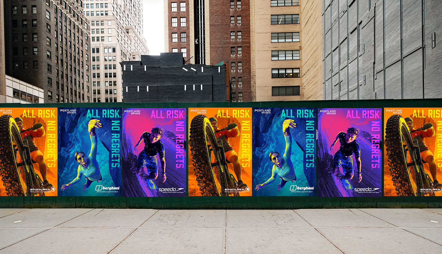
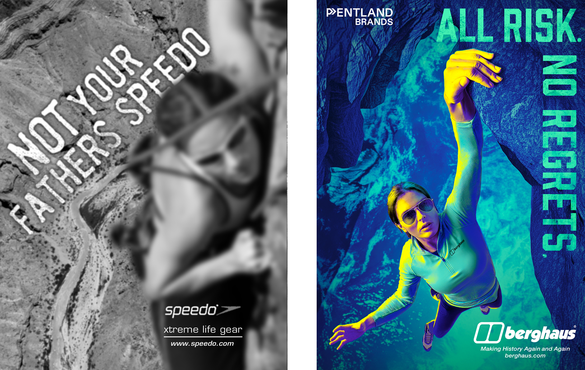
The draft copy was already organized into three chapters: The Pros, Weekend Warriors, and Not Your Father’s Speedo. Together, they created an array of experience. At one end, professionals whose lives are defined by discipline, repetition, and the pursuit of excellence. In the middle, everyday people who push themselves on the weekends, carving out victories between work and family. And at the far edge, the risk-takers, those who lean into danger, fueled as much by adrenaline as by skill, completing the spectrum.
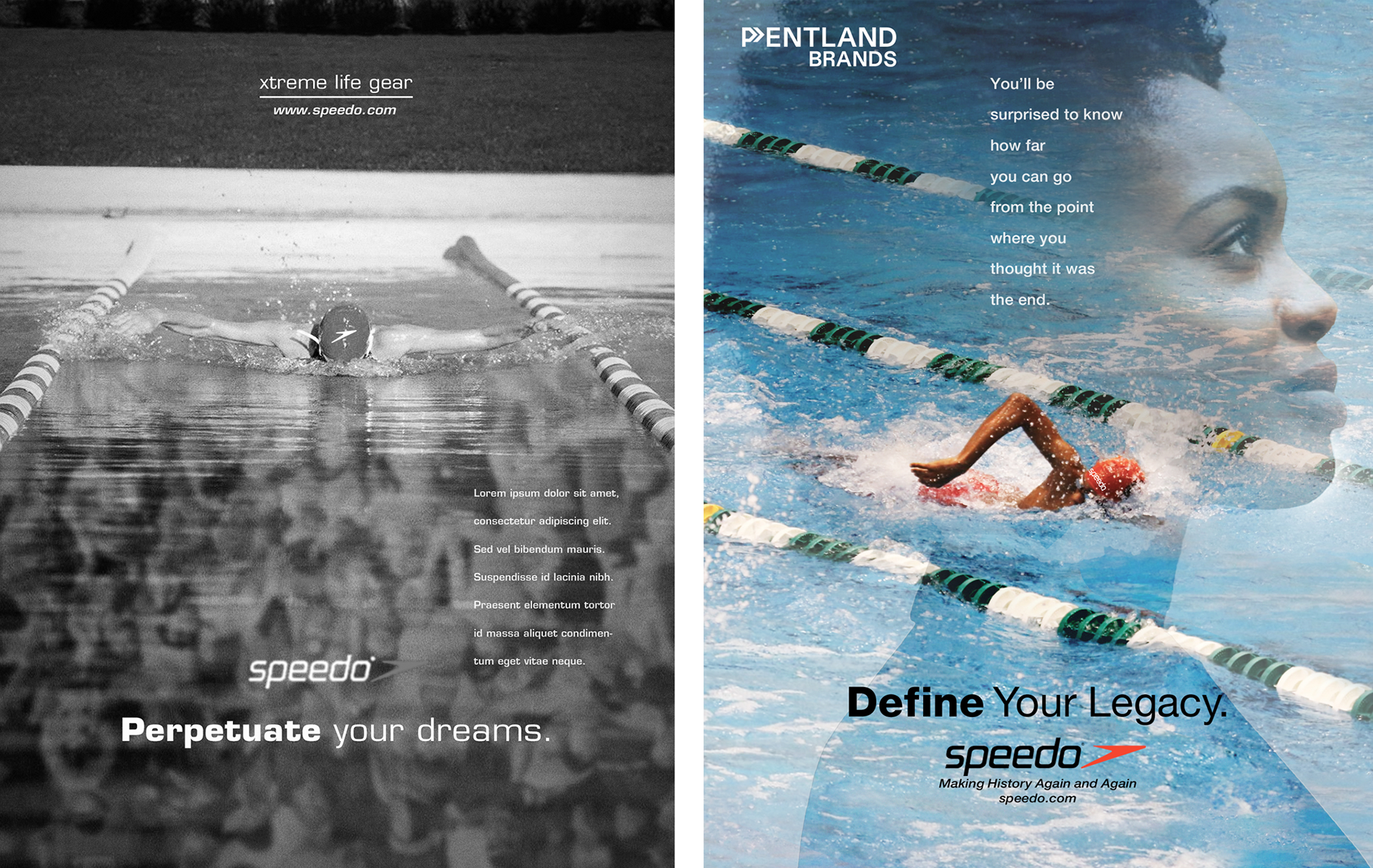
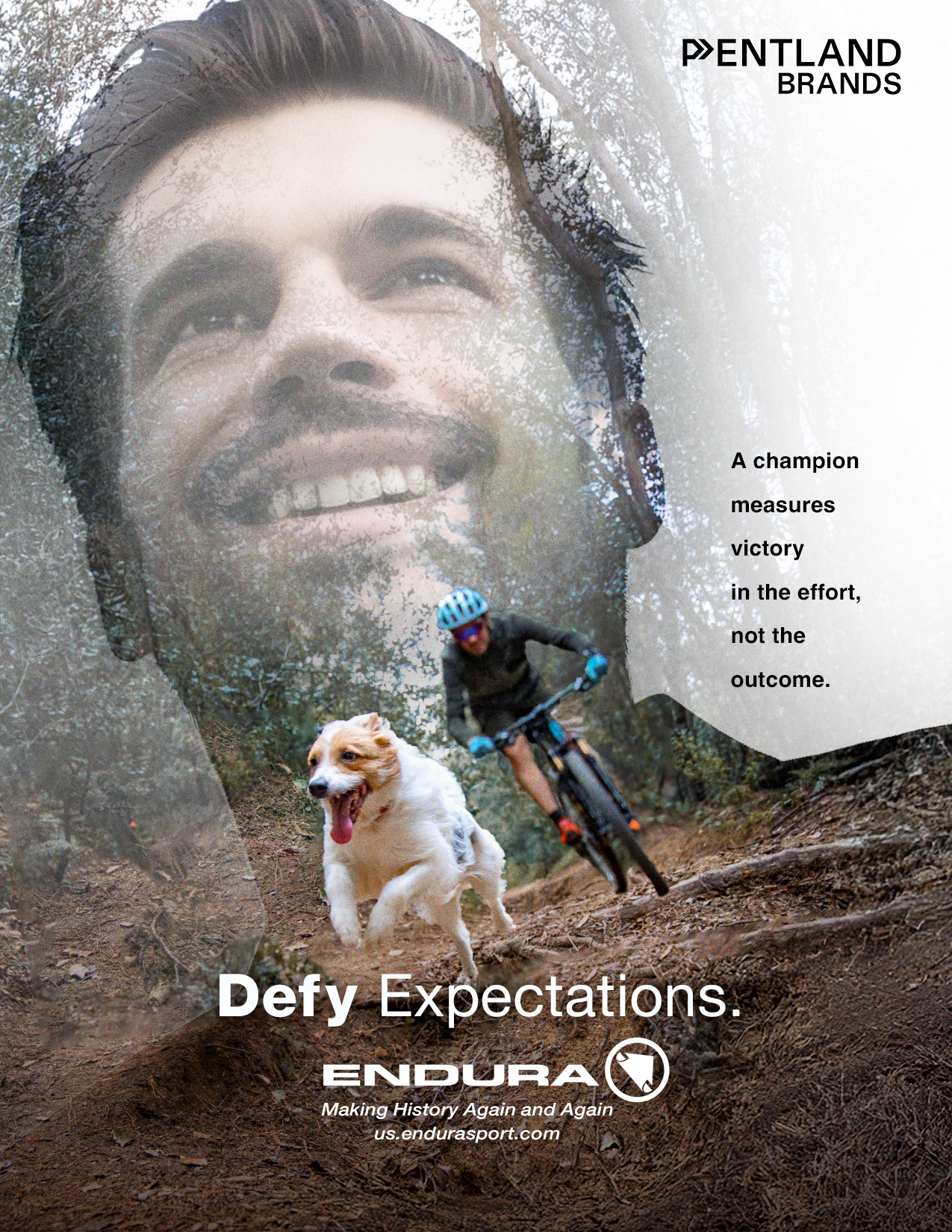
Even though the picture-in-picture concept isn’t new, it felt like the perfect visual device to tell the Weekend Warrior story — blending effort and reflection, motion and meaning, in a single frame.
What stayed constant across all three was the heart of the original concept: history isn’t a single moment or a one-time event. It’s the accumulation of every attempt, every effort, every story worth retelling. That through-line is what allowed me to reinterpret the campaign without losing its soul.
Section 4: Process & Tools
In 2003, Photoshop was Photoshop CS. Illustrator was Illustrator CS. The tools were slower, they felt heavier, and every edit felt manual. Fast-forward to today, and the toolbox has expanded beyond what I could have imagined. AI platforms like Midjourney and Leonardo helped me reimagine photography—changing what was needed, whether clothing, light, or context—while ChatGPT and Gemini refined details. Photoshop still anchored everything, bringing type, composition, and final polish together.
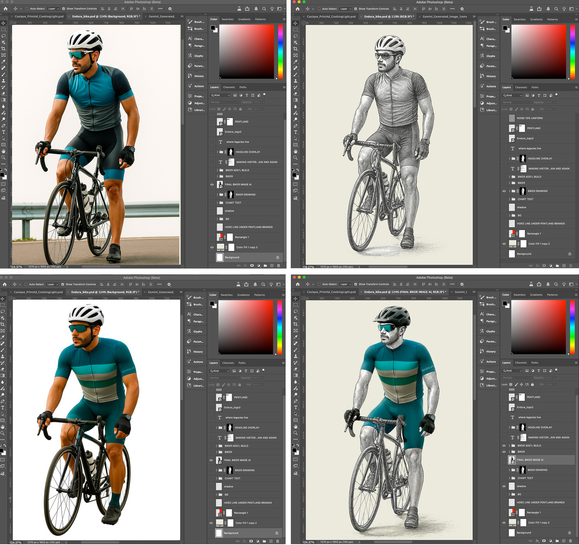
Each image in the campaign started with an AI-generated base image (top left)—prompted for pose, lighting, mood, and even product. However, the product didn't turn out the way it was supposed to. It was a trial-and-error process, for sure. From the initial image, I created a detailed engraving-style sketch based on a visual reference to unify the aesthetic across illustrations (top right). I sourced real product images—like the Endura racing top and shorts shown here (bottom left)—and integrated them into the composition to keep the design grounded in authenticity. The final step is where I combined layers from each phase, adjusted proportions, masked edges, rebuilt highlights and shadows, and color-corrected everything to feel seamless. This process was repeated for every tier of the campaign, balancing AI assistance with hands-on art direction and visual refinement.
The Pros
Section 5: Visual Development
The three smaller campaigns gave me different creative problems to solve. Each had its own rhythm, its own voice, and its own balance of product and story.
The Pros leaned hardest into the gear itself. This was the product-forward side of the campaign, where detail mattered most. Every piece of equipment had to look convincing, because the audience here already knew what to look for. I loved the look I developed, but I also questioned whether its sharp focus on gear set it apart too much from the other tiers. That tension became part of the process: how to make the imagery aspirational while still anchored in performance.
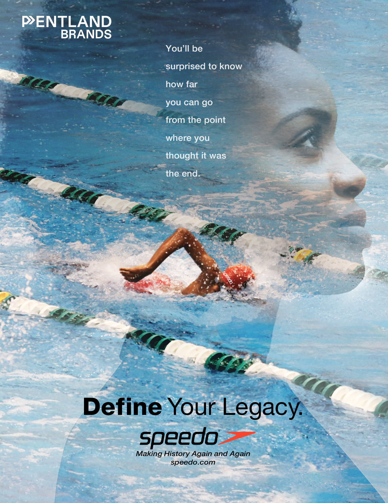
Weekend Warriors spoke in a different key. Here, the product was not at all front and center. It was about the lifestyle—the long Saturday rides, the dawn swims, the desert runs that start after a week behind a desk. These images had to feel accessible but inspiring, showing people who could be neighbors, coworkers, or friends pushing themselves just a little further.
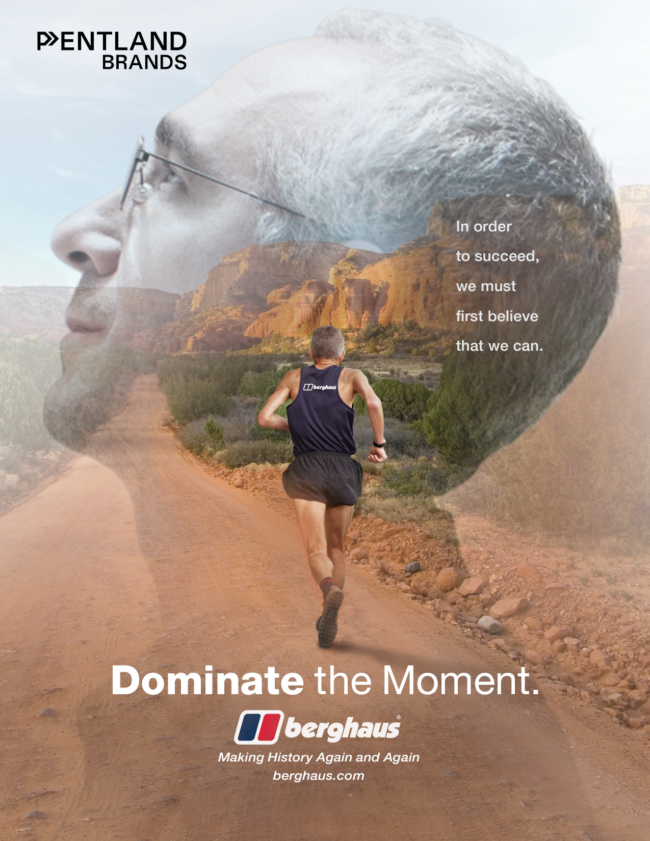
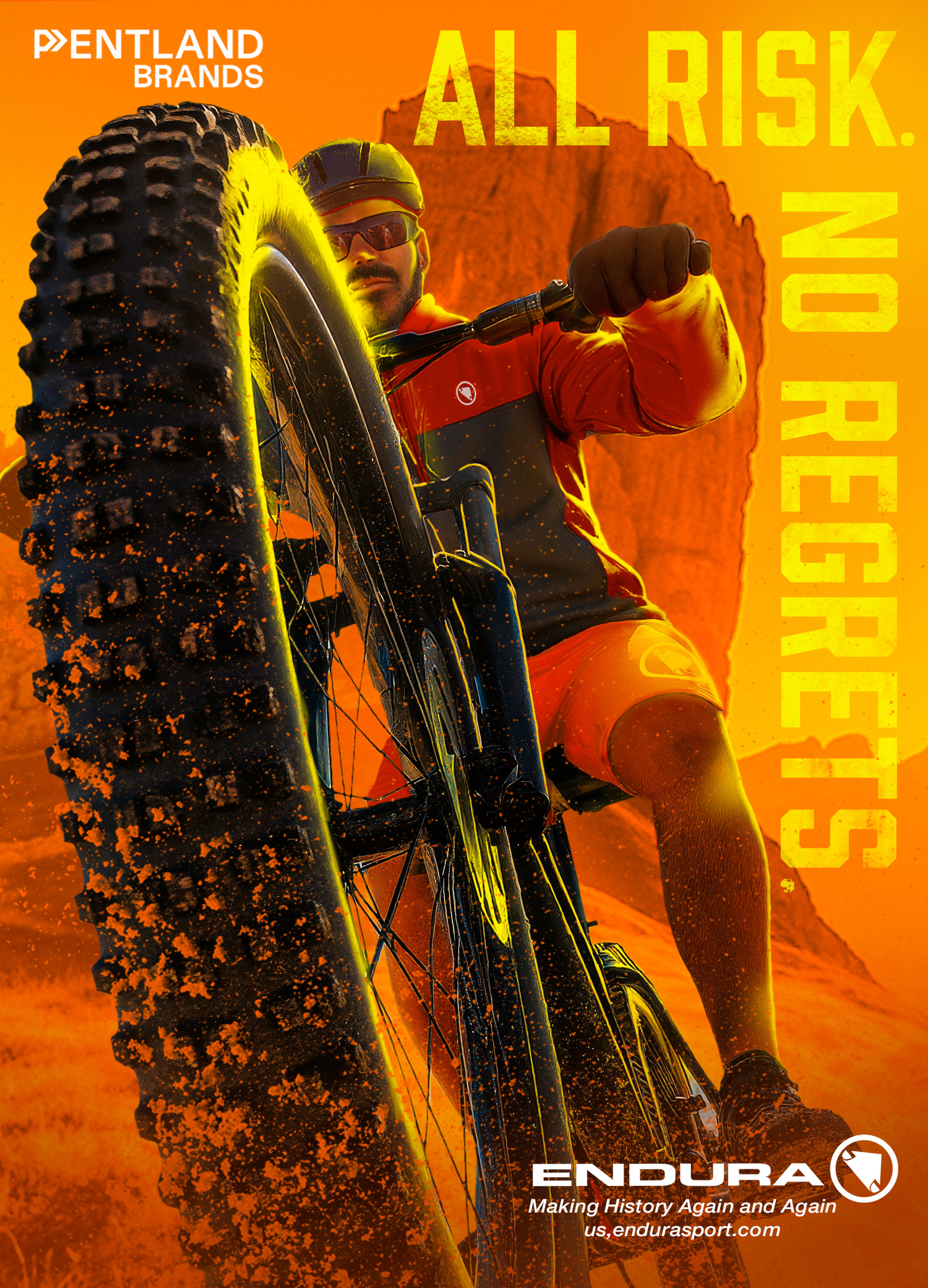
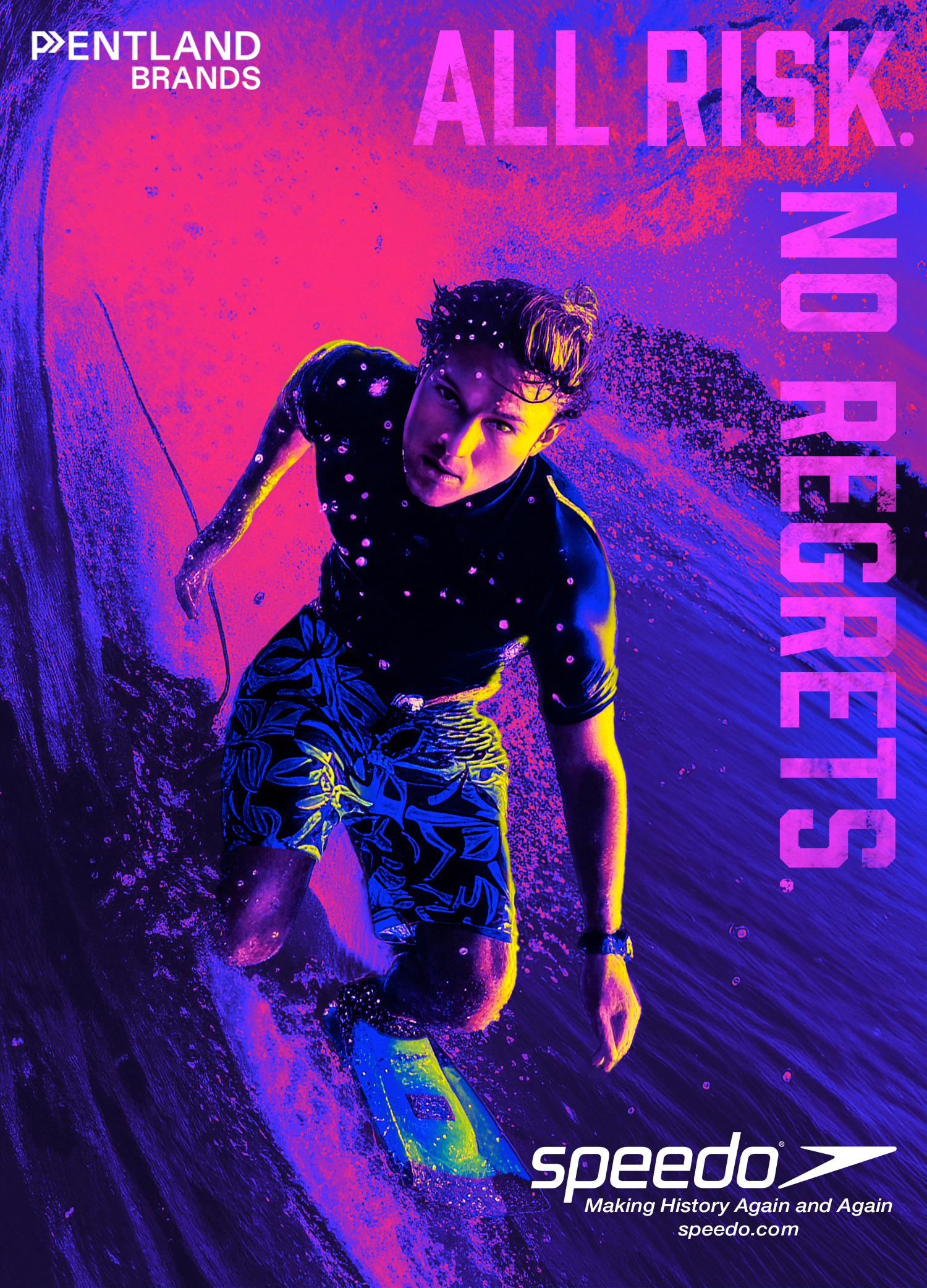
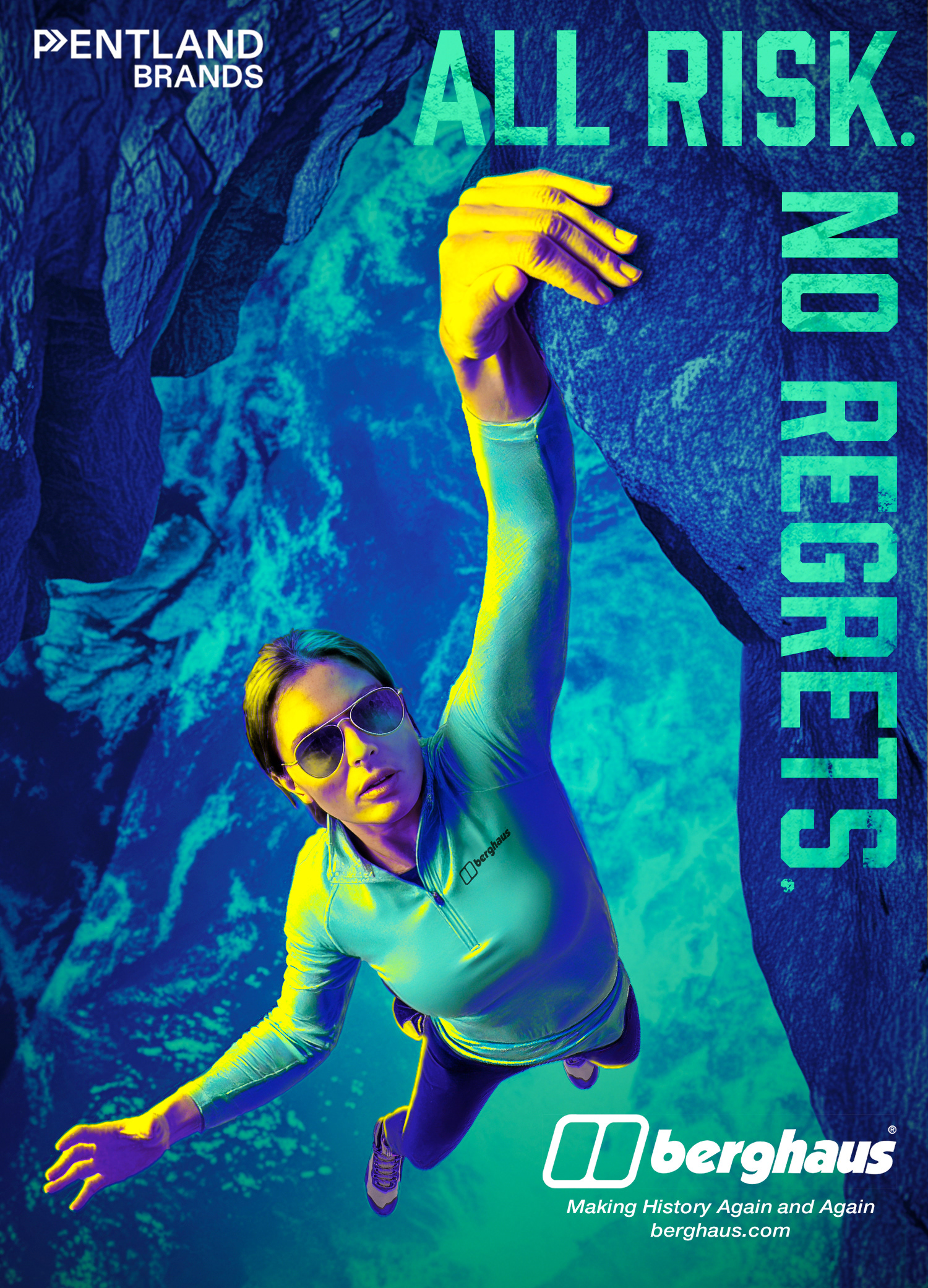
Not Your Father’s Speedo—the tier I now think of as Adrenaline Junkies—was pure attitude. This was the edge of the campaign, where risk lived. It was about speed, danger, and the thrill of testing limits. If The Pros were precise and Weekend Warriors were relatable, this tier was electric. The challenge was capturing motion and risk in still images—finding ways to make the viewer feel a heartbeat quicken just by looking.
Across all three, my goal was consistency without sameness. The typography tied them together, the layouts carried a rhythm, and the tone stayed true to the central idea: history isn’t just made in stadiums, but on roads, trails, cliffs, and waves.
Weekend Warriors
Section 6: Reflection / Outcome
Revisiting this campaign years later wasn’t about nostalgia—it was about perspective. What began before I made the crossover to entertainment—learning how to piece together stock photos and layouts under pressure—became a chance to re-evaluate the same idea with a deeper skillset and new tools. The core values never changed: clarity, empathy for the athlete, and visuals that tell a story. But the way I could reach those values evolved dramatically.
This project reminded me that campaigns age, but ideas don’t have to. Making History Again and Again worked in 2003 because it honored legacy while pushing forward. It works now for the same reason, only with the added weight of time—my own history layered on top of the brands’. It became as much a reflection of my journey as it was a showcase for Speedo, Berghaus, and Endura.
In the end, this project wasn’t about producing perfect ads. It was about testing myself, respecting the legacy, and proving that good creative survives shifts in technology. The campaign still resonates because it’s less about a single moment and more about continuity—the kind that threads through brands, athletes, and my own career.
Which brings me to the people and sources that shaped both the original campaign and this reinterpretation.
Adrenaline Junkies
Section 7: Credits
This campaign was never a solo effort. The headline “Making History Again and Again” and the original idea to carry it across three tiers came from my writing partner in 2003. My role then, and again today, was to bring those words to life visually.
The visuals here were built on existing photography, adapted strictly for concept development. AI helped me reimagine those sources, but the foundation always began with real photography. This project is shown as a creative exploration only—not commercial work. You know, for fun. Yay!! As well as a personal challenge.
AI didn’t invent this campaign, nor did it replace the creative process. It was a tool, much like Photoshop or Illustrator, that expanded the possibilities. The thinking, the choices, and the responsibility for how the campaign came together remain mine.